PIXEL REFLECTION ©️
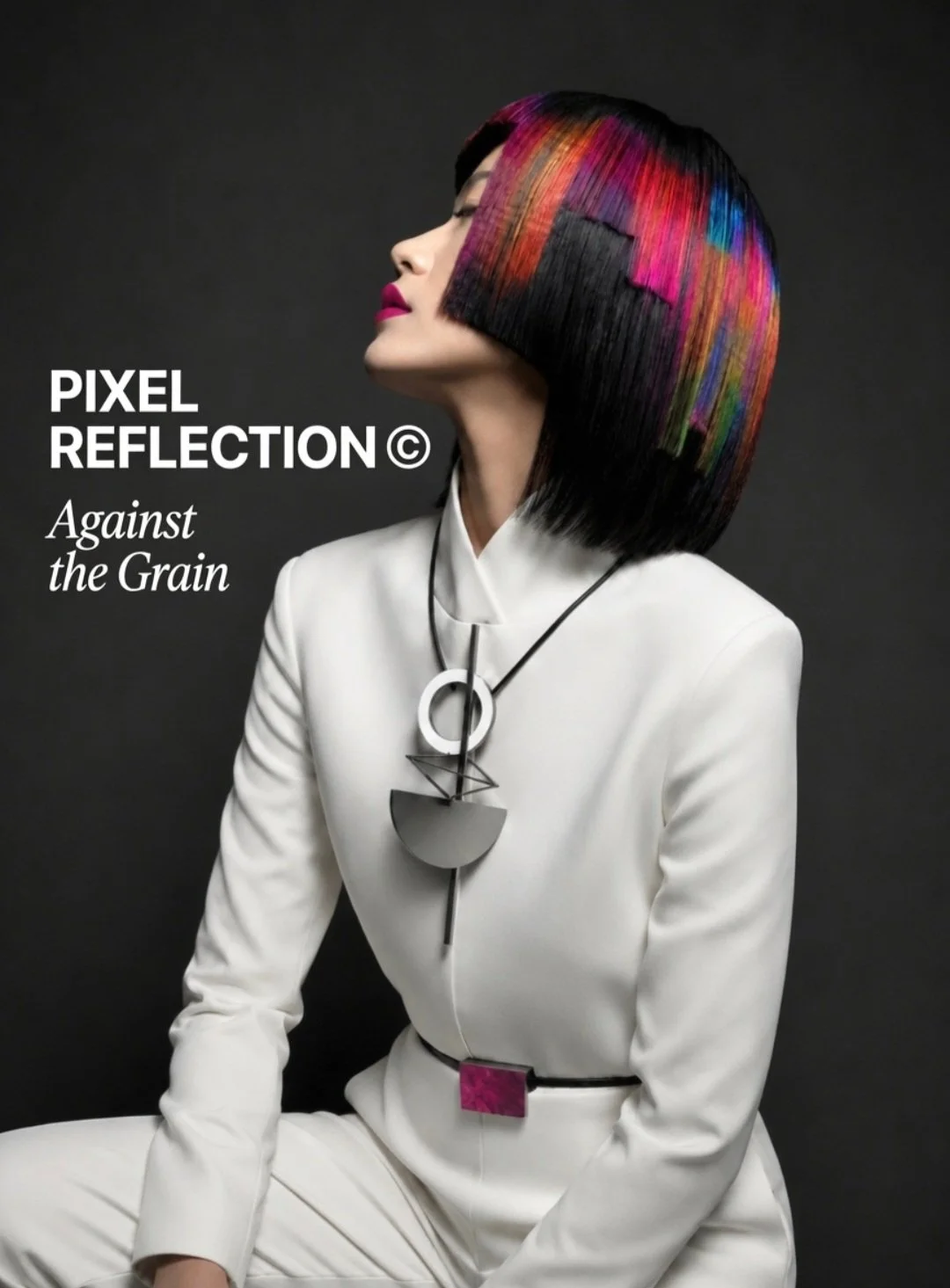
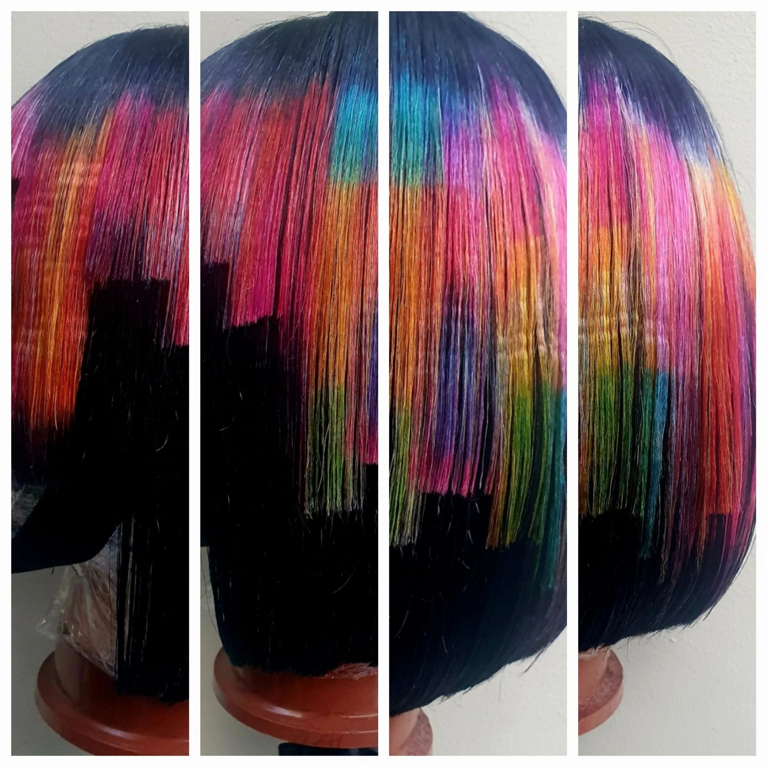
PIXEL REFLECTION© — A Cubist Question
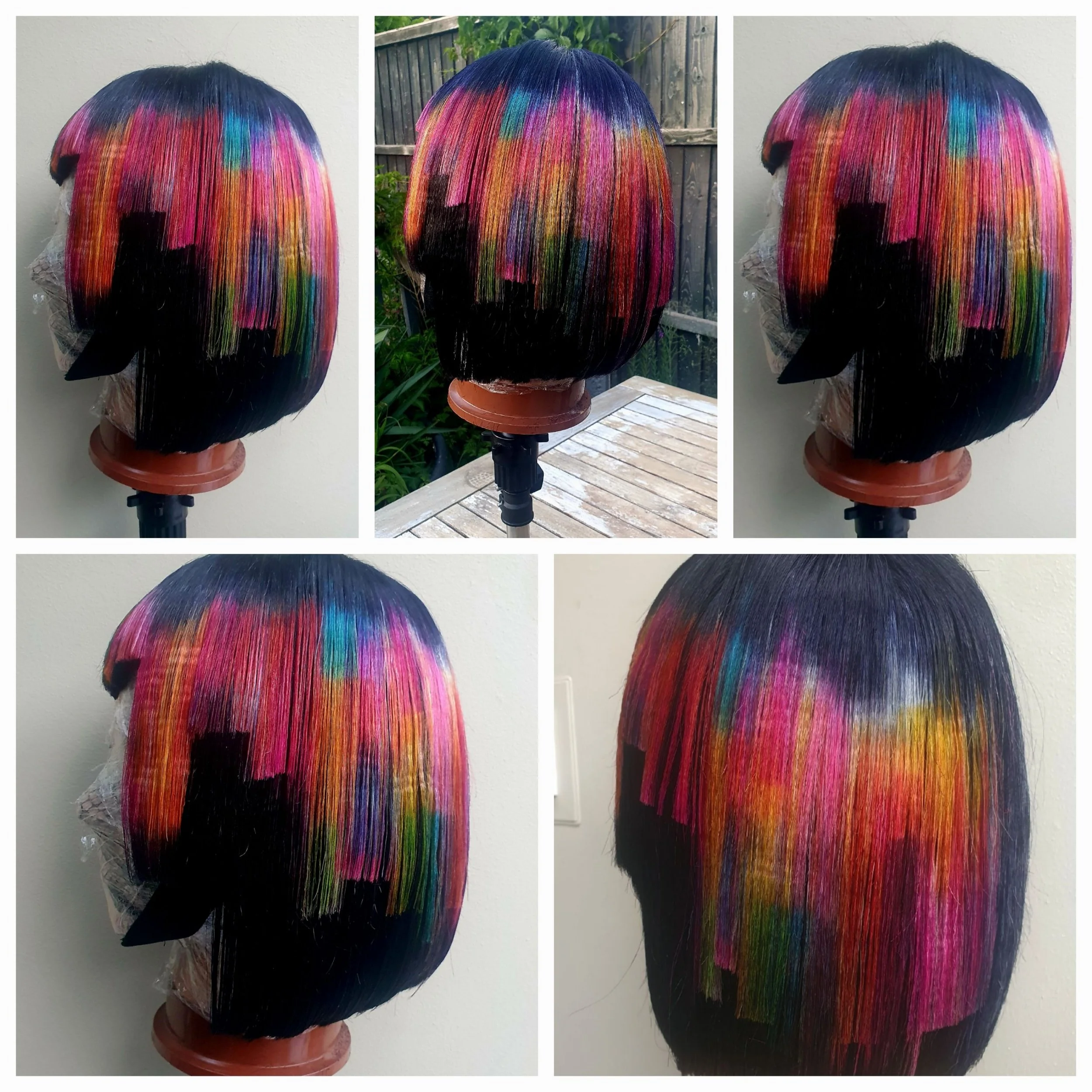
PIXEL REFLECTION© belongs to the Cubist Collection — colour placed in blocks, breaking across a black canvas in staggered planes. It's abstract by nature, the way Cubist painting often is. This was never meant to be a soft, blended rainbow — it's something else entirely, closer to painting in blocks of colour than styling hair in the conventional sense.
This piece grew organically rather than from a fixed plan, in flow rather than to a design. A little would go in, then get altered, tried again, until finally the planes were cut in and it just clicked. The name came after, once I could see what the piece actually was.
The black in this piece isn't just what's left once the colour stops — it's doing as much work as the colour itself. Negative space and positive space, working together rather than one serving the other. It's an old idea in painting, going back to the Renaissance use of perspective and composition, and it holds just as true in hair.
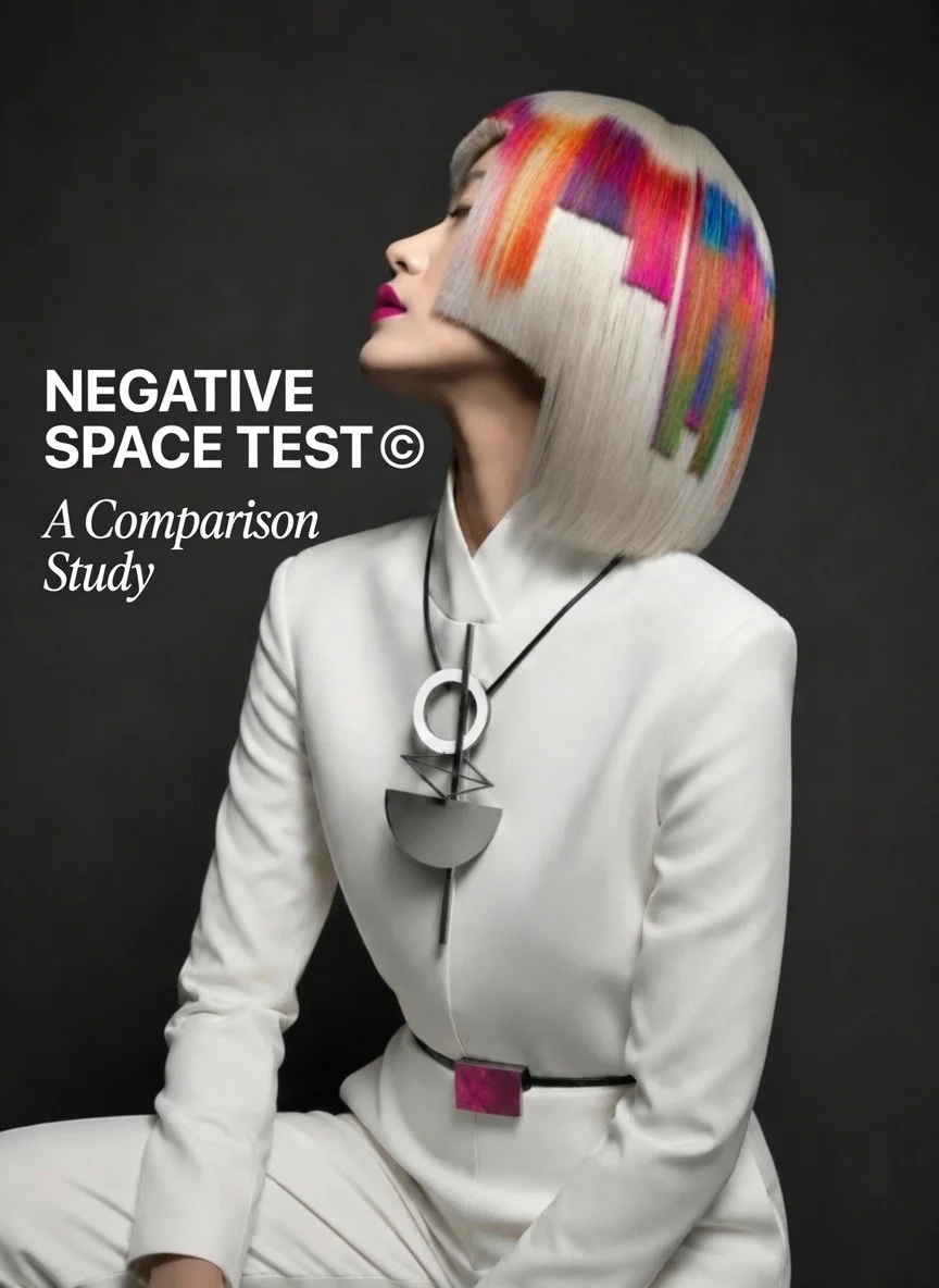
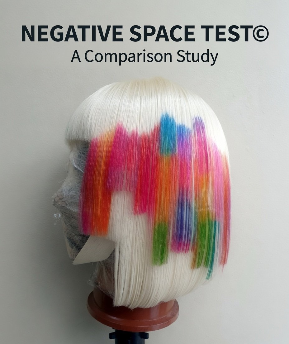
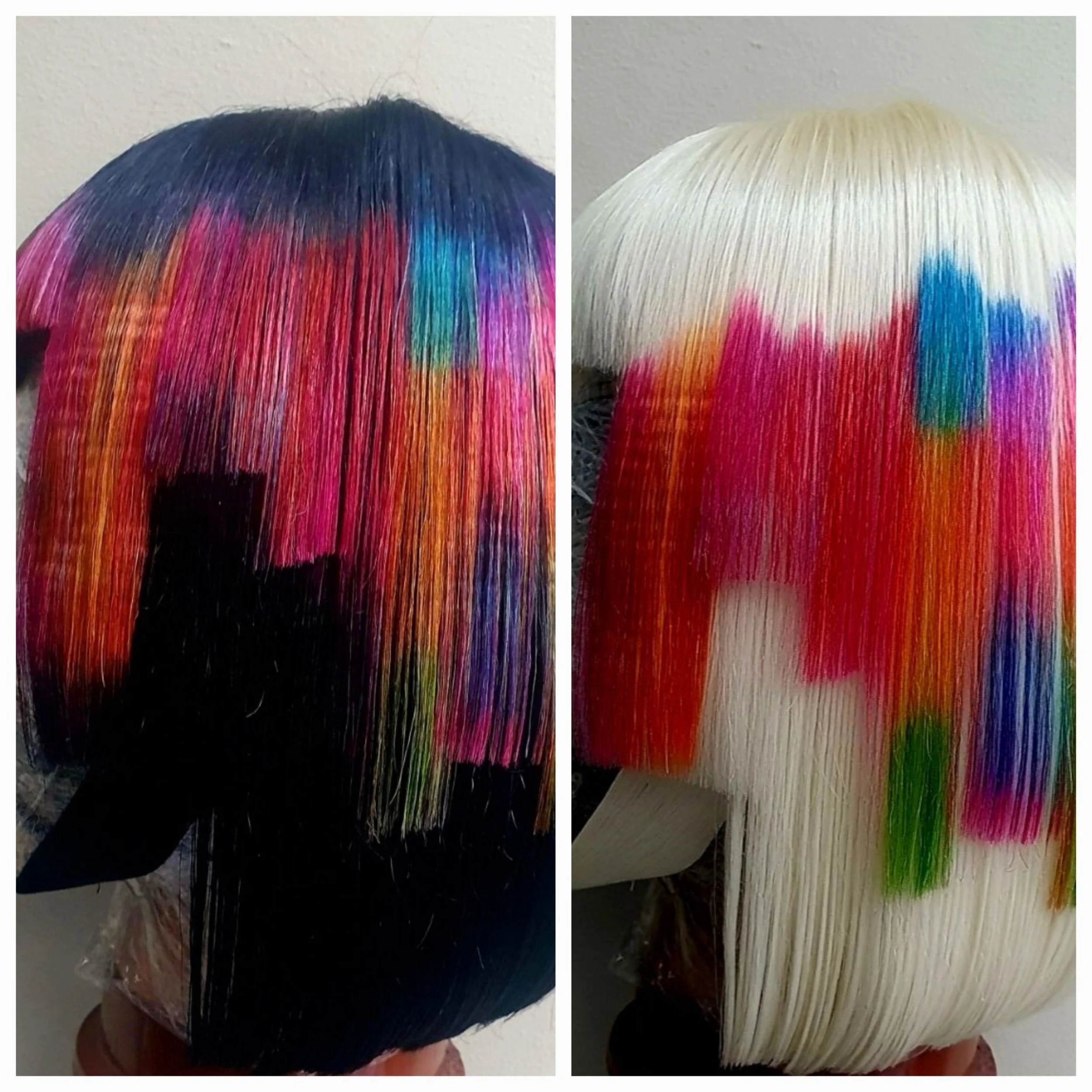
Negative Space Test
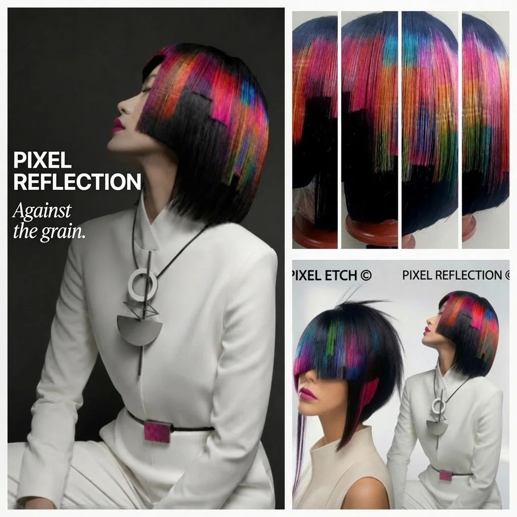
Out of curiosity, I tried the same colour placement against a different base — platinum instead of black, both on the real wig and through AI. The colours didn't integrate the same way at all. Against black, the same blocks read as one formed, deliberate piece. Against platinum, they lose their edges and start to look lost — floating, uncertain of where they belong, without the same sense of composition holding them together. It's not a perfect side-by-side (the platinum piece wasn't crimped the same way the original was), but it's honest enough to make the point: the colour didn't change, but the negative space it sits against does all the work of making it look composed rather than accidental.
Why "Pixel Reflection"?
Black absorbs almost everything — light, colour, definition — except the colour placed deliberately on top of it. With nothing else to compete against, that colour reads as sharp and resolved. And because the black holds every plane together as one continuous depth, the whole piece reads as integrated — a single composition rather than separate blocks. That's the reflection: not light bouncing off black, but colour standing out precisely because black gives it nothing to blend into.
Platinum works the opposite way. It doesn't absorb — it sits at roughly the same brightness as the colour itself, so nothing holds the blocks apart from their surroundings. Without that contrast, the colour has nothing to push against and nothing to be integrated by. It doesn't fail — it just floats, the way it did in the test above.
"Black doesn't reflect light back — it gives colour somewhere to stand out from. That's the reflection."
Wearability
A version of this could genuinely be worn. On straight to slightly wavy hair, the weight of the blocked sections and cut planes will pull the shape down somewhat, so straighteners might be needed to finish and hold the lines. A straighter, more solid perimeter on the fringe could help too. There's no single way to adapt it — that's left for the reader to work out for themselves.
Whether this works for you or not is entirely your own call — that's the nature of it. Others might look at the same idea and build something completely different from it, and that's exactly as it should be.
Try it differently. Stagger it your own way, change what it sits against, and it becomes something else entirely.
Transparency Notice
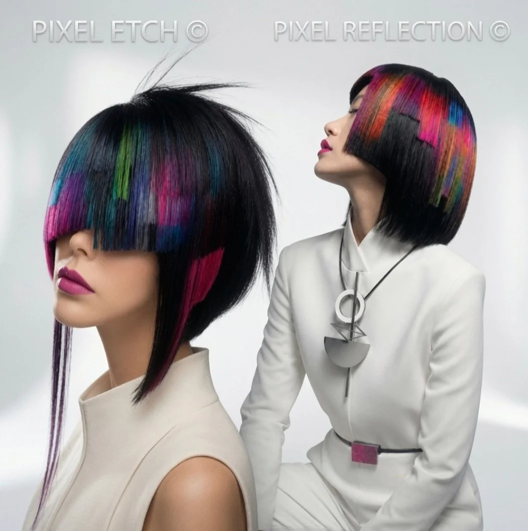
Some images in this post were created with AI, to give an indication of how this piece might look on a model in a professional editorial setting — I'm no longer able to access photoshoots physically, so this is how I can still present the concept that way. It doesn't always reflect the exact wig perfectly, but it captures the idea for presentation purposes. Other images show the real, physical piece.
Images below are a combination of the original piece alongside-
AI presentations, A presentation of AI models PIXEL REFLECTION ©️ PIXEL ETCH ©️ together and Negative space test images.