AMETHYST©️ Strata Collection
STRATA COLLECTION
AMETHYST
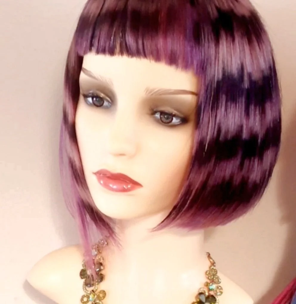
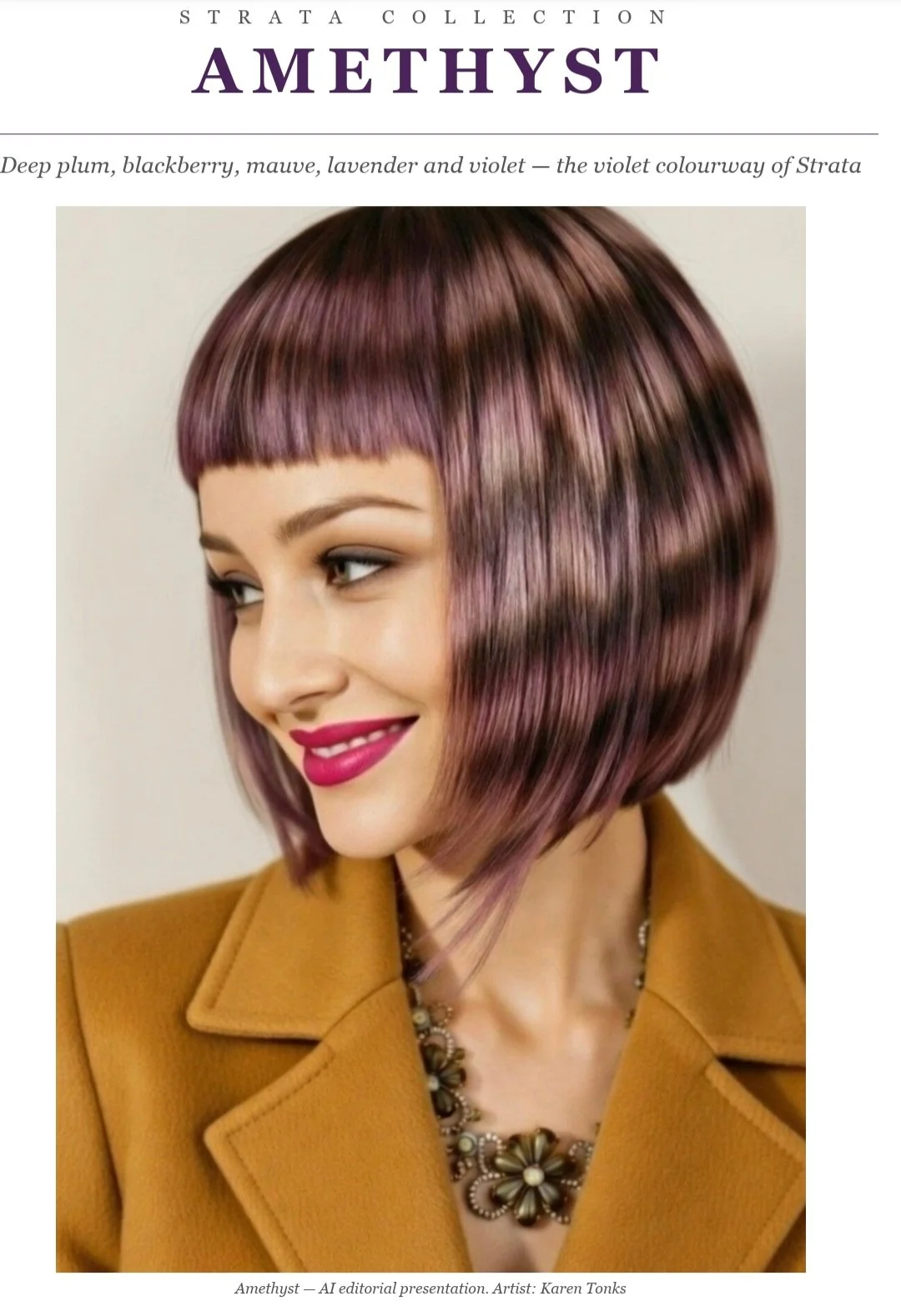
Deep plum, blackberry, mauve, lavender and violet — the violet colourway of Strata
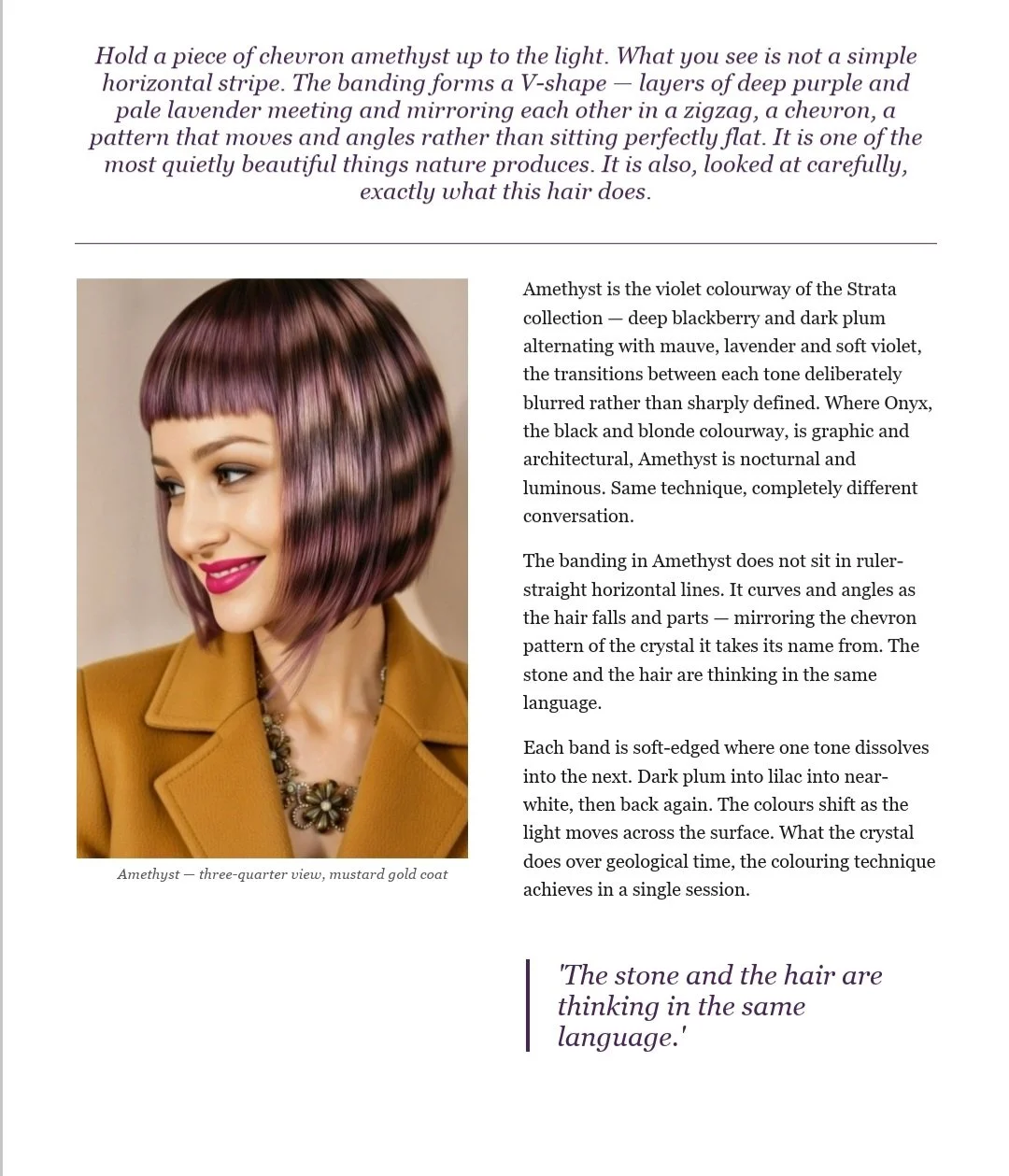
Hold a piece of chevron amethyst up to the light. What you see isn't a simple horizontal stripe. The banding forms a V-shape — layers of deep purple and pale lavender meeting and mirroring each other in a zigzag, angling rather than sitting flat. It's one of the quietest, most beautiful things nature produces. It's also, looked at carefully, exactly what this hair is meant to do.
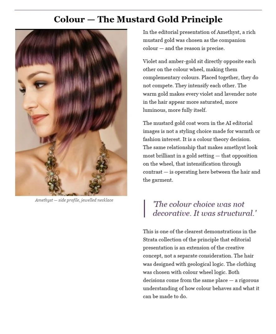
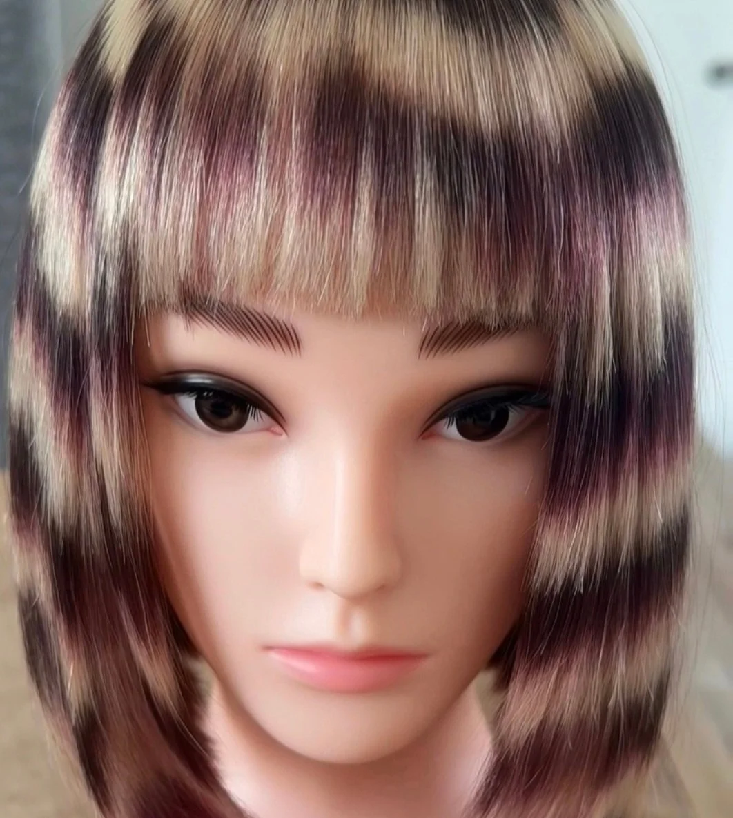
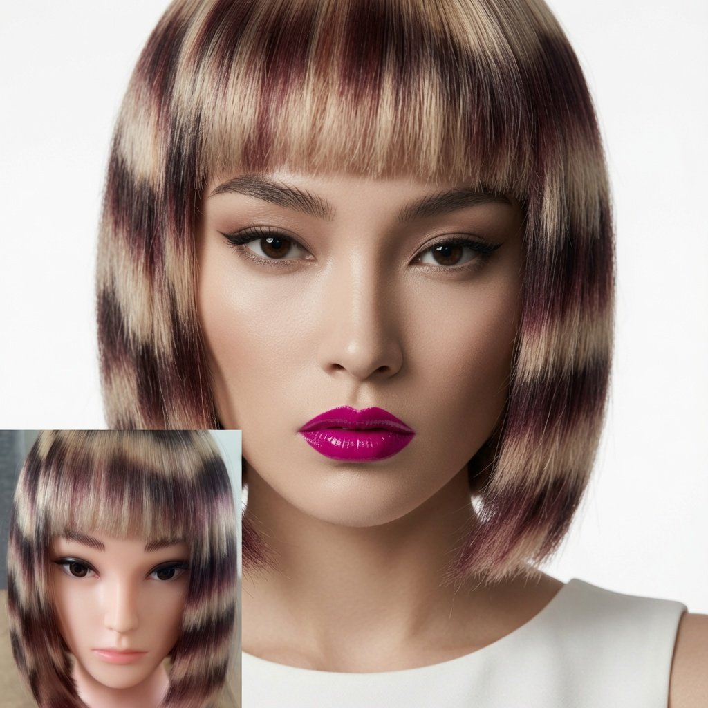
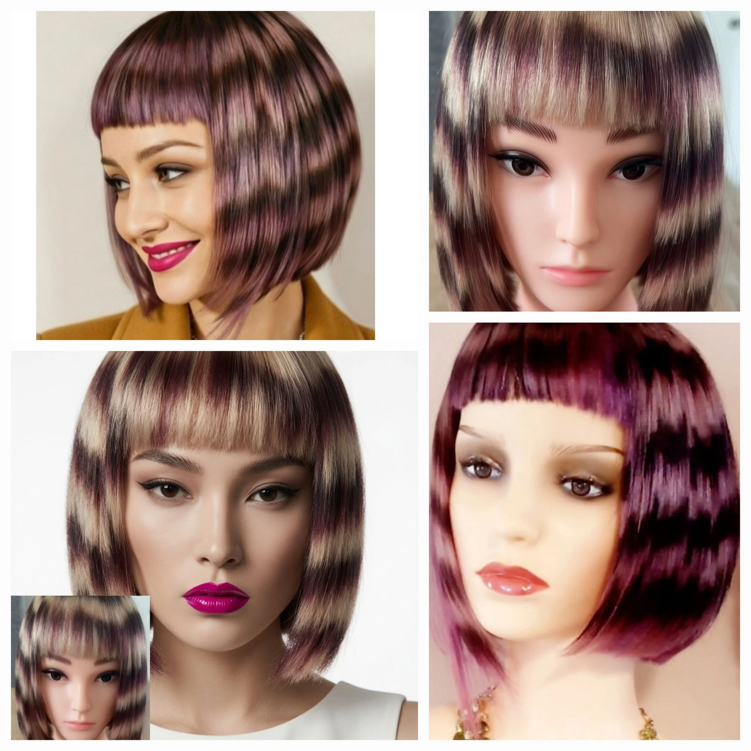
Amethyst is the violet colourway of Strata — deep blackberry and dark plum alternating with mauve, lavender and soft violet, each transition deliberately blurred rather than sharply defined. Where Onyx, the black and blonde colourway, is graphic and architectural, Amethyst is meant to be nocturnal and luminous. Same technique, a completely different conversation.
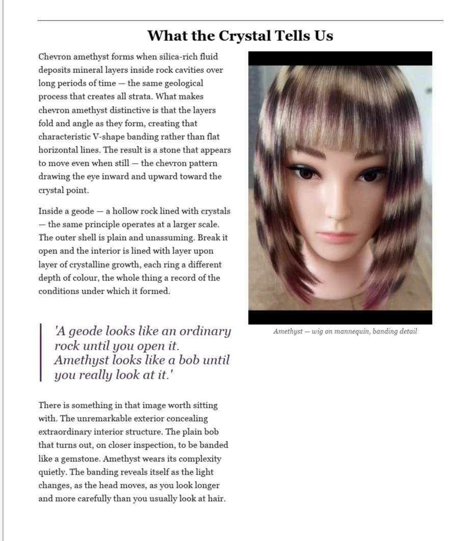
Chevron amethyst forms when silica-rich fluid deposits mineral layers inside a rock cavity over long stretches of time, the layers folding and angling as they form rather than lying flat. A geode looks like an ordinary rock until you open it. Amethyst was designed to work the same way — a bob that looks plain until you really look at it, the banding revealing itself as the light changes and the head moves.
What actually happened
I have to be honest here, because that's the whole point of this brand.
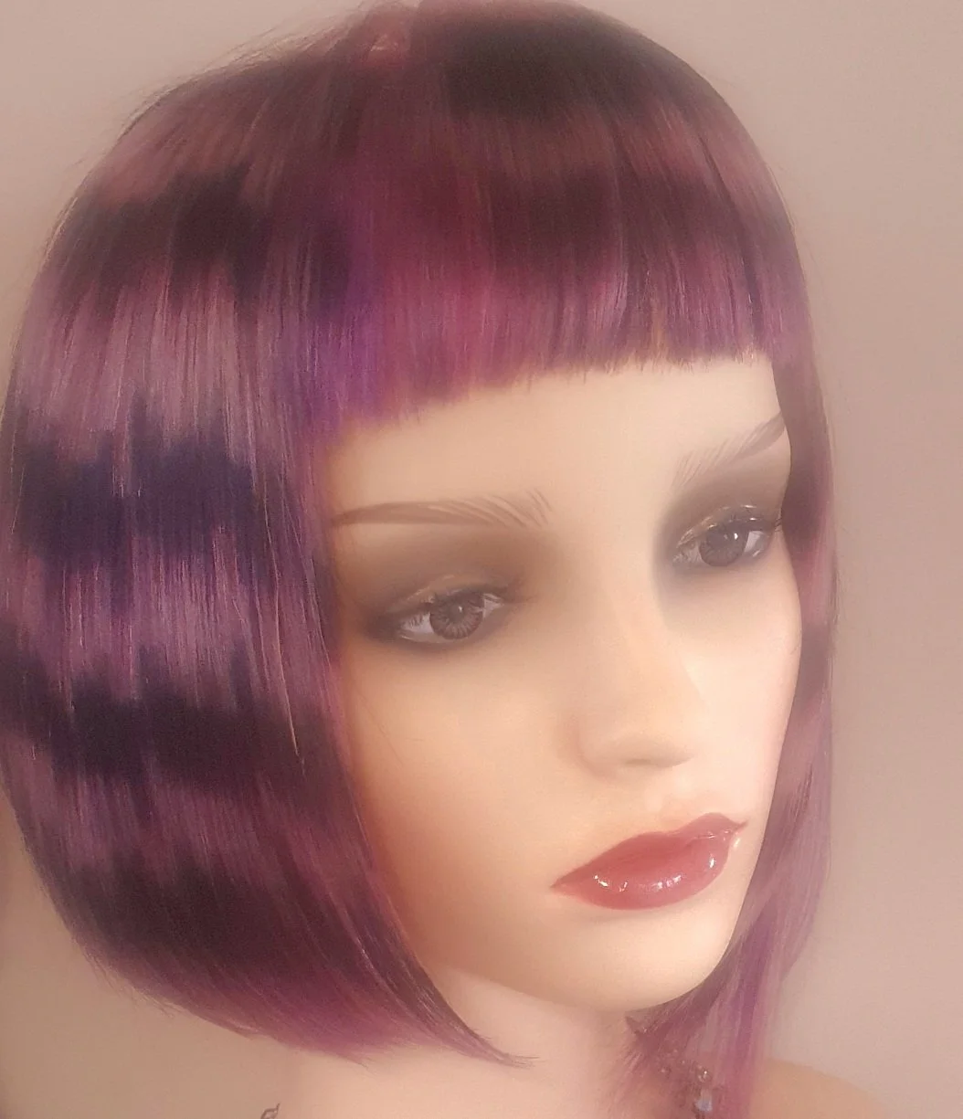
The photos of the finished piece aren't in the best light, and even allowing for that, the pattern doesn't show up quite as much as I wanted it to. It's there — the chevron still moves — but it's quieter than it should be.
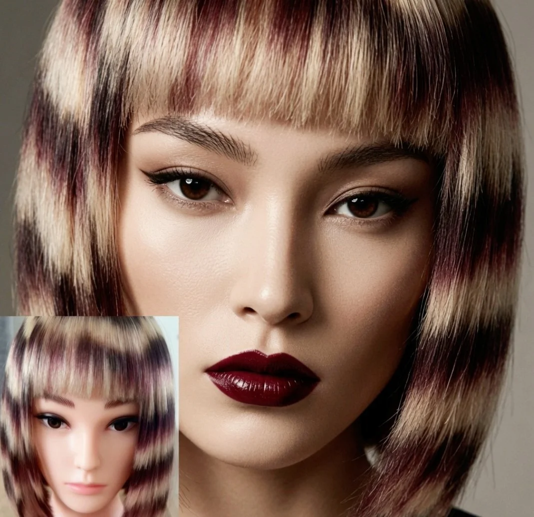
The reason is a colour decision I made and regret. I mixed a lilac tone — somewhere between lavender and violet — and took it over sections of the blonde. Looking back now, that was too close in depth to the plum and blackberry sitting either side of it. Instead of standing apart as its own distinct band, it blended into the darker colour around it and lost definition. The contrast that made the earlier version work — blonde against deep purple — is exactly what got softened away.
Lessons learned
If I did this again, I'd go the other direction entirely: something in a baby pink, soft and warm rather than cool-toned, so it would sit apart from the plum instead of dissolving into it. Cool-on-cool, however pretty in theory, needs more depth separation than I gave it here. Warm against cool is what would have made the banding read the way chevron amethyst actually reads — distinct, layered, catching the light differently as it changes.
It's a good reminder that a technique can be right and a tonal choice can still let it down. Amethyst as a concept still stands. This particular execution taught me where the edges of it are.