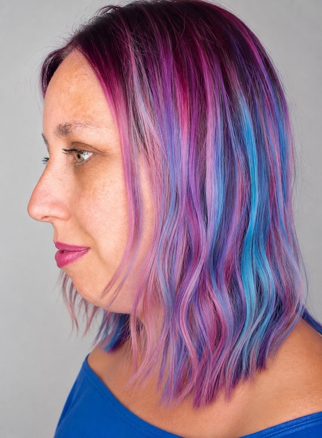
PRISM VOW ©️ Teresa Collins parsons
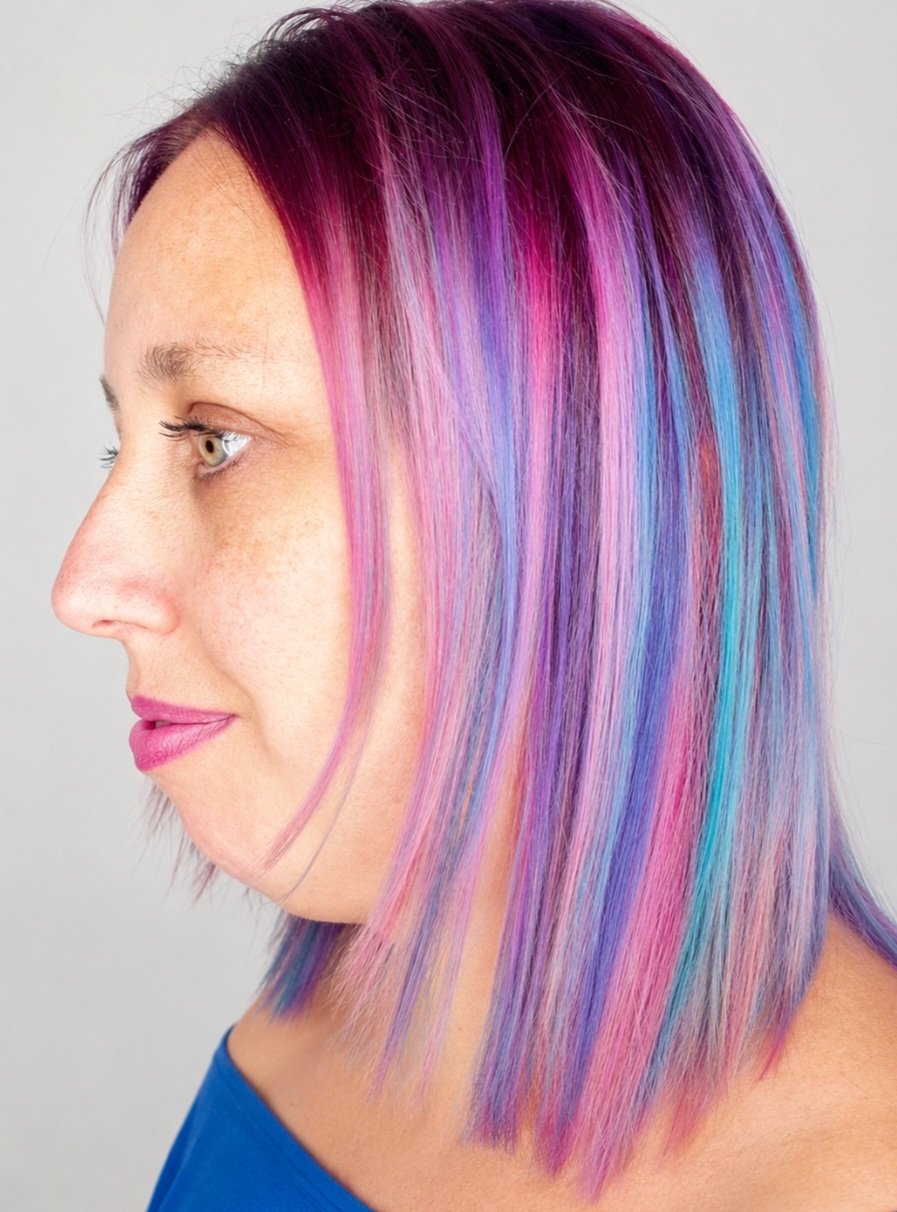
PRISM VOW©
Teresa and her husband were friends of my family and particularly my late Dad.
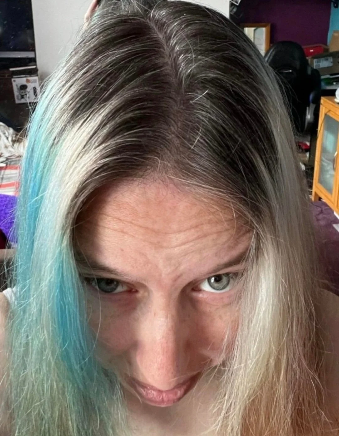
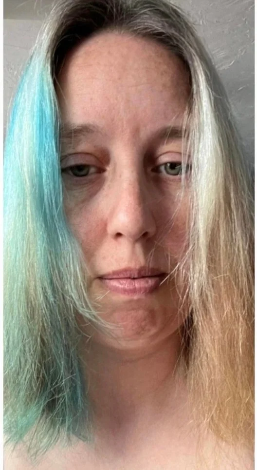
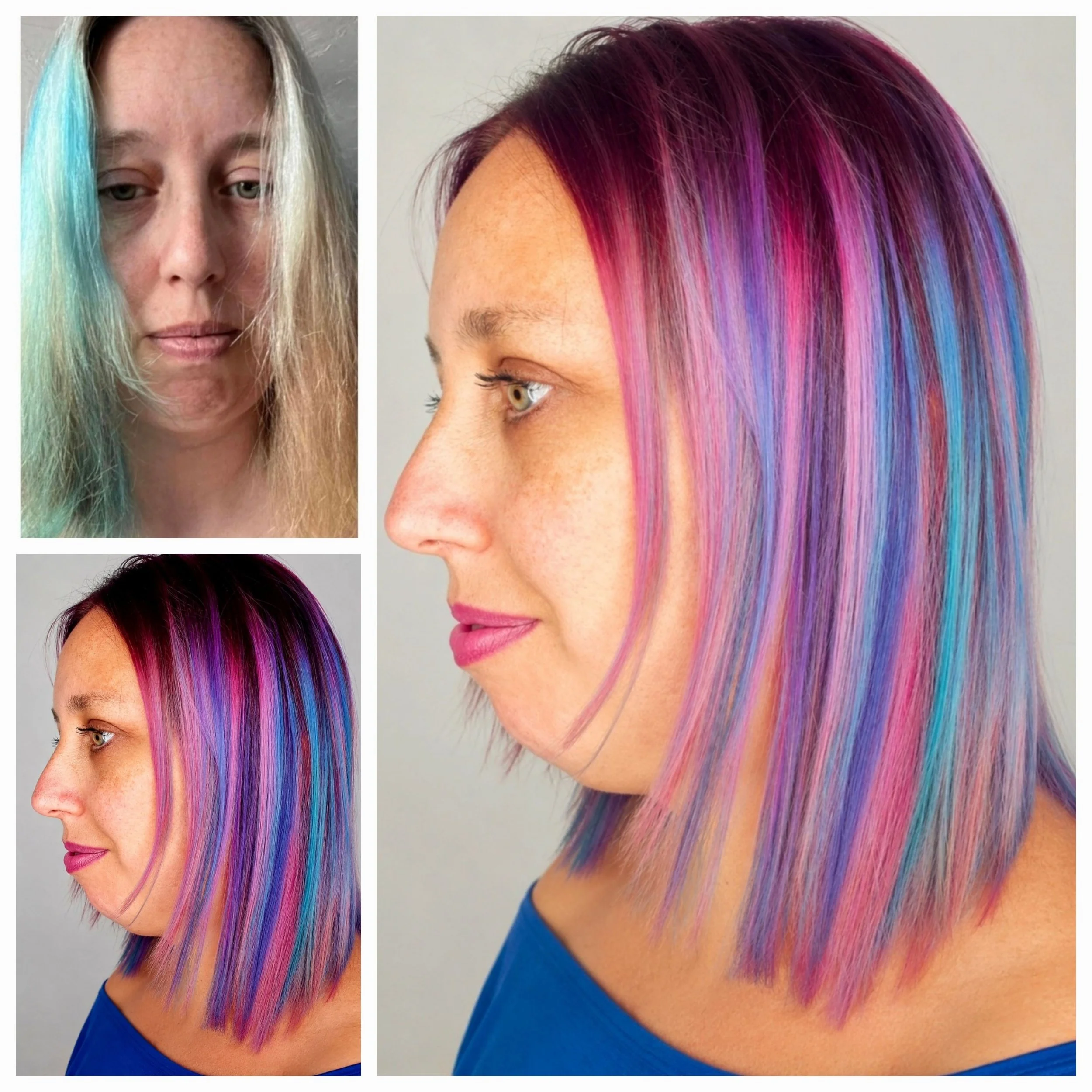
Teresa came to me with a split-dye that had grown out and faded — teal on one side, pale and worn on the other, with natural regrowth coming through underneath: her own darker hair, intermixed with sprinklings of white. The hair itself was already a little dry which tends to happen with lightened hair .so bleach wasn’t on the table at least to begin with. This one needed a gentler route.
We started with a deep-cleansing shampoo to draw down some of the existing blue before touching a single strand of new colour. From there, a violet-based tint was mixed through and worked in — chosen because it would sit well against her natural depth without needing lift. A direct dye colour remover took the leftover blue down further, though not out completely, which turned out to be the right call. What was left behind gave us a soft, faded turquoise running through the ends, rather than the harder block of colour Teresa arrived with.
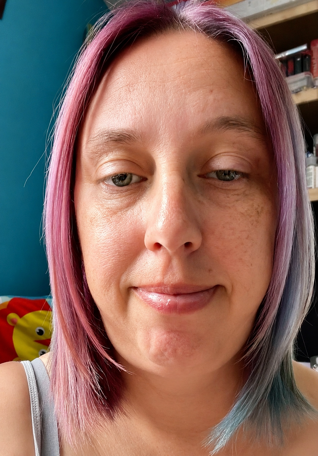
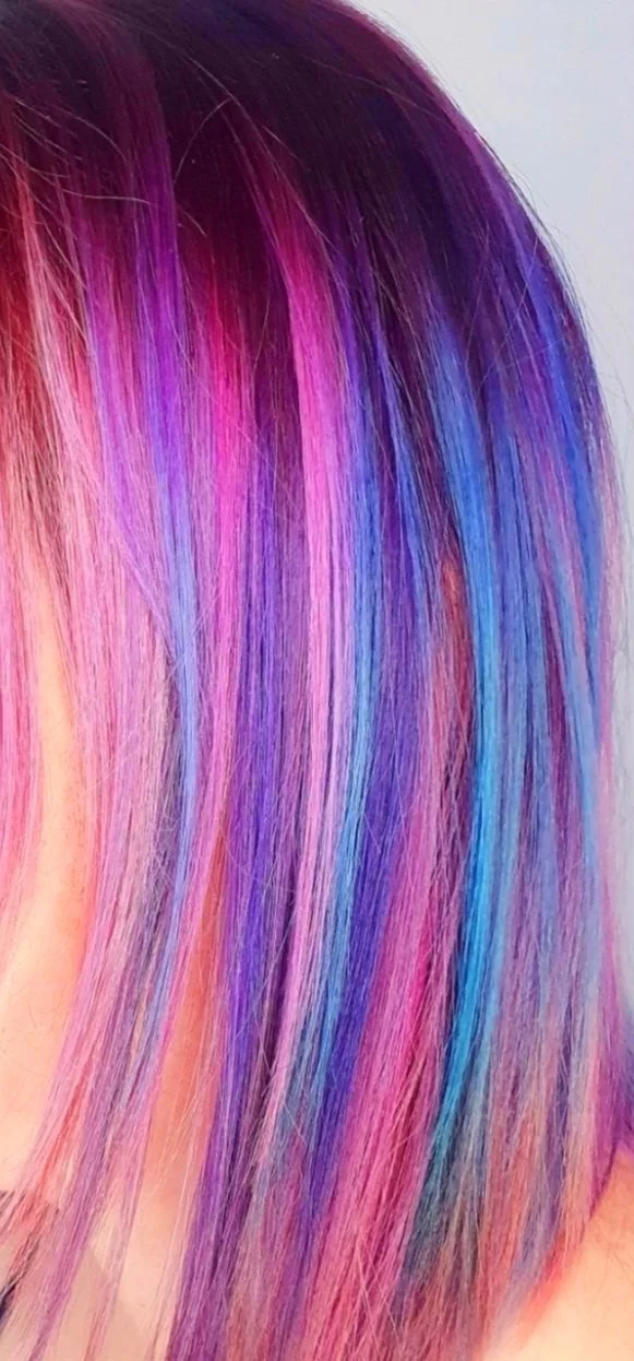
The result is an integrated blend rather than a split — deep root tones opening into magenta and violet, settling into that faded blue-turquoise toward the ends. Nothing about it reads as segments anymore. It moves.
This was done as a phased project ahead of Teresa's wedding, with the colour intended to keep evolving gradually over time. In the end she wore it up for the day itself — but the work, and the process behind it, felt worth documenting regardless.
Interesting fact — Teresa had always known she saw colour a little differently, though she'd never had a name for it. Curious, we did some digging together to try and understand it better. What she described was that purples and violets can read as a mucky orange, though it varies with the light — in good lighting the true colour comes through more, in other conditions the orange creeps in. It made this piece feel even more meaningful once we started looking into it: a look built entirely from violet, magenta, and blue means something quite different to her eyes than it does to everyone admiring these photos. We're not experts in this field, but from what we found, her experience seemed to sit somewhere close to either tritanopia or protanopia — two different types of colour vision deficiency, each with its own particular way of shifting the world.
Photography by Karen Tonks.
Lighting edits
Below we reimagined the style with beachy waves.Teresa looks so pretty with these colours and a blue top.